Relationship between color and conversion

What role does color play in consumer buying?
Up to 90% of subconscious judgement is based on color.
It is a bold claim but there is a multitude of research that backs it up – for example, analytics company Loyalty Square found 85% of total respondents thought color was more important than many other factor when choosing a product to purchase. Further research by Zero Above, an award-winning marketing agency, found on average people make subconscious judgements about a product within 90 seconds of seeing it, and up to 90% of that judgement is based on the color alone. What’s more, research by QuickSprout showed 85% of shoppers’ state color as the primary reason for making a purchase.
Studies showing the impact of color on conversion
Hubspot reported Performable changed the color of their main call to action (CTA) button leading to a 21% increase in conversion rates. All other elements of the page remained the same - only the color of the button was changed, and it was the change of button color from green to red that resulted in the impressive increase in conversion.

Similarly, VWO reported Ript Apparel changed their CTA button from green to yellow resulting in a 6.3% uplift in sales. Furthermore, the company DMIX tested both red and green CTA buttons on 600 test subjects and found using the red button led to a conversion increase of 34%.
An example away from the online world that shows the effect color may have on sales is Heinz. ColorCom reported when Heinz switched the color of their signature ketchup from red to green the sales boomed, selling 10 million bottles within the first seven months, a sales result of $23 million and the largest increase in sales in the company’s history.


How color can boost your rates of conversion
We are sure the above case studies show color really does make an impact on people’s buying decisions and therefore a websites conversion rate. So, how can you better use color to increase conversion rates your site?
1. Establish who your target demographic/market is
Different people are influenced by different colors in different ways.
The above case studies illustrate this point; for Performable it was switching their CTA button from green to red that led to an increase in conversion, however for Ript Apparel changing the color from green to yellow led to the uplift.
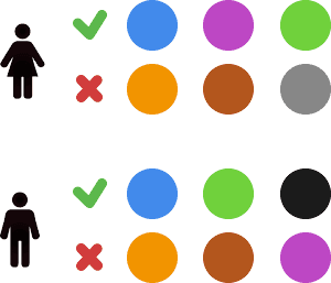
Exploring this idea further, research by Joe Hallock shows men and women possess an affinity for and attraction to different colors. Women strongly react to purple, blue and green, and men react to black, blue and green. It is a subtle but significant difference.
The gender differences when it comes to preferences for color is also supported by research from the University of Maryland’s Philip Cohen, who surveyed 2000 men and women, asking their favorite color was.
Here are the results:

2. Understand color theory and psychology
While there are no set rules and the color scheme that will be most effective in driving conversions for your eCommerce site is going to be largely dependent on what your industry sector and target demographic. However, there is a generally accepted and understood set of colors worth knowing about.
Almost all color combinations leading to increased conversion, no matter the target audience or industry, will usually follow some principles of color theory. This theory is based on extensive research and human psychology, so they are worth knowing to better understand why specific colors or color combinations have a positive or negative effect on buying decisions and therefore rates of conversion. There are many online resources for learning color theory.
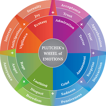
Closely related to color theory is color psychology. Robert Plutchicks Wheel of Emotions illustrates the relationship between different colors and emotions.

