An ultimate guide to landing pages

Landing pages are king, homepages are not. Meh.
Do A/B testing. Yawn.
Use customer feedback as the basis of your optimization strategy. Boring...
Every statement is true. However, none of them sound inspiring, in fact they sound lame.
If you don’t want to be a lame marketer, well, read on to find out.
A word of warning, in the absence of witty metaphors and charming anecdotes, this post may be laced with bad jokes.
Almost everyone reading this will have been caught in the position of a stomach rumble or groan in an inconvenient is a signal of worse to come. Your quest to find a bathroom becomes almost as ambitious as climbing Everest. Finding what works for landing pages can be a journey almost as epic.
Firstly. A list of five bullet points you should commit to memory.
1. Firstly we will explain the rationale behind why landing pages are like oxygen for marketers. Essential for survival.
2. We will prove why the context – and not the content – rules when it comes to making conversion happen.
3. After that, we will make you love forms. And trust us, it is really difficult to make love for forms happen.
4. Halfway through we'll sip on some Jack Daniels, make like the Mad Men and learn how to write copy that works.
5. Finally, we will play art critic and take a close look at some examples of landing pages, good and bad.
We’ve laid down the gauntlet. And we will no pick it up (on your behalf).
Part one: Why landing pages are king, and the reason you should never use your homepage for directing traffic to
If we have held your attention so far, it is probably because of our masterful prose.
However, the only word in the above sentence that is important is ATTENTION.
Holding the attention of your visitors is not something you can count on if they don’t get the right conversion experience.
A positive conversion experience is when your visitors feel compelled to pay attention and therefore fulfill your conversion goal - by clicking on the call-to-action (CTA).
A negative conversion experience is where your visitors simply leave your site without doing anything.
There are three elements of attention we need to consider:
1. Capturing the attention of your visitors
2. Maintaining the attentions of your visitors
3. Focusing the attentions of your visitors
Point number 1 should be covered by your ad, and your landing pages are the solution to number 2 and point 3, so let's begin with 2.
Ingenious insight number 1: the attention ratio
Pay close attention as we set the scene.
Say you are running a promotion marketing campaign: "50% off Ellen DeGeneres dance off DVDs"
We have your attention, don’t we?
Let’s explain attention ratio.
The ratio of interactive elements (AKA links) on a page versus the number of campaign conversion goals
Bearing that in mind, take a look at the diagrams below. The first one represents a typical homepage, while the second one is a landing page that is campaign specific.
The homepage
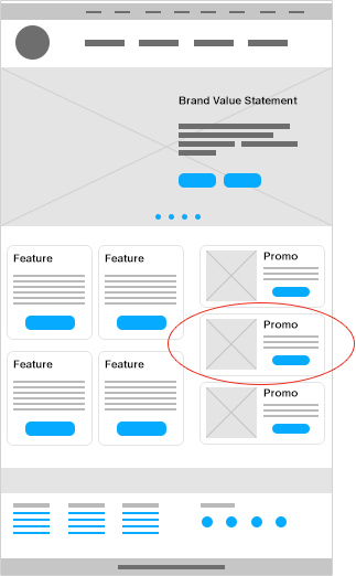
On this example of a homepage, your “dance off” campaign is "promo 2" as circled in red.
The remainder of the page features other Ellen promotions, links to her Instagram and other social media profile, navigational links, footer navigation, a photo slider, and so on.
Directing people to your homepage - from social media, email or a paid ad – the campaign conversion goal you intend is forced to fight to win the attention of the visitor with all of the other interactive links on the page. Your average homepage features about 40 links.
The example above has a total of 56 interactive elements, that means:
Attention ratio equals 56:1.
It is a bit like being presented with a smorgasbord and not know what you want…
But don’t take our word for it. Over-stimulus and being spoiled for choice and the effect it has on people has been studied at Princeton University. By neuroscientists no less.
The neuroscientists found the more you are presented with, the more each element of stimulation is competing for your "neural representation" – in other words, your attention.
Returning to our highly scientific experiment in marketing, let’s place our dance off promotion on a landing page that is dedicated and campaign-specific.
The landing page
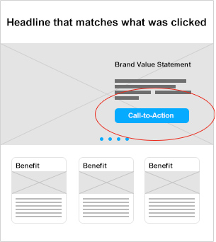
On a campaign-specific and dedicated landing page, the whole page has a single focus the dance off DVD campaign.
The text is all directly related to goal of the campaign with only one link or interactive element – the CTA button.
Therefore your attention ratio here equals 1:1
Now let’s take a look at an example of a company doing this right. Customer relationship management company Salesforce has a complex array of products. The company’s website features a large number of different pathways.
If you search around the site, it seems their primary goal is to sign you up for a product demo. This is not surprising given how complex their software is.
So what happens when you perform a Google search for Salesforce? Your first organic search result takes you to the company’s homepage. However, the first paid ad (at the top of the page) leads you to a completely different page. Presumably because searched for the company by name and therefore demonstrate a level of knowledge about the company.
The page you land on looks like this:
It is a well-designed landing page with a single goal. For you to watch a demo of one of the company’s products. There is a little room for improvement, the CTA and headline could mention more about the purpose of the page (to watch a demo). Also, note the button. It is darker hue of the same color as the form box. IT’S A NO-NO! Salesforce would be wise to use some contrast.
Putting those things aside, it is a focused and well-designed experience.
Ingenious insight number 2: conversion coupling
Congratulations, you’re half-way to being smarter than the vast majority of marketers.
We are talking about synergy. Not our favorite word.
Here is the second point in almost everything you should know in order to be the smartest person in the auditorium at a marketing conference.
Conversion coupling is the connection existing between the source of a click and the resulting landing experience
Explained more fully, it comprises of at least one of the following:
- Matching messages: Matching the text of your ad to the landing page headline.
- Matching design: Matching the display ad’s design to that of the landing page.
- Let's look at good examples and bad.
Matching messages
Matching messages is the concept of ensuring the pre-click message matches the post-click message on a landing page. The goal is to make people think they made the “right click”.
The message on the page should reinforce the reason they made the click, thereby avoiding confusion.
Here's an ad example:
If the link leads to a homepage, the target headline might look like this:
Complete More Projects with Less Management
This might or might not be a good headline expressing brand value proposition, but it does not match the ad. The result? A bad message match.
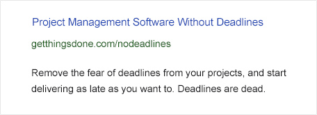
In this instance the correct headline should be:
Project Management Software without Deadlines
The result? It is an identical match for the headline of the ad, and therefore a message match. As the saying goes, this is not rocket science.
For really strong matching messages, make the subhead of your landing page reiterate the point of the description of your ad.
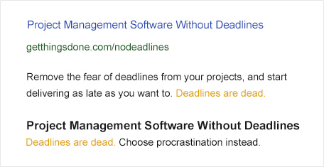
This example presents aspects of an idea known as conversation momentum, which we will get to later. Basically you can see the subhead is a repeat of the end of the ad’s description "Deadlines…" and finishes the sentence the way people do when they are in the honeymoon phase of a relationship.
The cute factor is upped by the fact it rhymes.
Matching design
This is an easy technique to master. Take your display (banner) ad design and repeat it on your landing page.
Let’s dive deeper into that.
This time we'll start with an example that falls on the good side, from RBC Canada via Facebook.
The Facebook promotion:
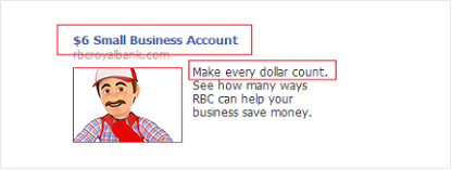
And the landing page:
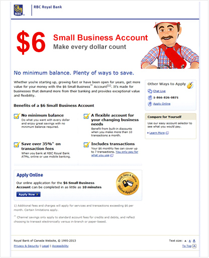
The message matches perfectly, as does the design. Meanwhile that little mascot has followed you from ad to landing page bringing his sign with him.
But, taking a closer look at the landing page, the page does have attention ratio problems (7:1), while the CTA is too small. If you squint your eyes, it is the trust seal and not the CTA that stands out.
An improvement would be to display the different account application options on the next page after a click has been made confirming interest.
Meanwhile the CTA would be clearer if it was bigger and in a contrasting color.
Part two: Context is everything
The more testing we do, the more we come back to one unifying concept. Context. Let’s look at context in action.
First, a couple of key concepts. Hope you are paying attention.
2.1 Conversation momentum
Conversation momentum’s purpose is to eliminate the break in communication which can occur when a click happens. If you are courting someone in a blog post or email, it makes sense keep doing that on the landing page.
Look at it this way you wouldn't invite a person into your home and then act like you didn’t know who they were would you?
This concept centers on respect. Respect the click and the time you want your visitor to spend on you.
Imagine including this line in your email.
"Let us show you how our product and services can help you."
Sometimes a good way of keeping up momentum is to thank your visitor.
"We’re glad you are interested in finding out more about..."
Making the experience enjoyable gives the relationship a more human dimension and shows you care.
It's also important to get to your point quickly (as in a short email), but it should also appear natural.
"One of the most important things to know about (the words in the link) is that it can (set out what the benefit is)."
That’s an improvement, but how about this?
"What our solution does is makes (words in the link) easier to do. Should you wish to trial it, we will pay the first month. And we have staff on standby if you want to talk about the best way to use it."
How good is that?
Now consider the boring, dime-a-dozen, bordering on rude approach:
"Let us show you how our product and services can help you."
"We are the best (at whatever we do) in the world. Sign up for a trial now."
So, you stopped caring about your customer, and now sound staid and generic and acting out of self-interest.
2.2 Context of use
Context of use means to provide a visual demonstration showing how a customer will use your product or service.
We can't emphasize strongly enough how important this is for conversion.
Here’s an example with regards to landing page templates.
It is well-known research is key when A/B testing. It tells you when you are using the wrong marketing message, and provides insight into business opportunities.
So, we did a little research.
When a visitor comes to your landing page, the first thing they do is look for help and subconsciously ask:
"I know the reason why I came here, but I'm not sure where to look or what to look for."
Your task as a business, is to know and understand what your potential customers are thinking when they come to your landing page, and communicate with them appropriately.
You need to remember a large number of visitors via organic search will arrive with zero context. They search for "landing page templates" and are only thinking about templates - not where or how they can be used.
Part three: How to make friends forms and influence people
Forms may not be aesthetically pleasing and they may mess with your designer’s vision of how a page should look but they are a staple of a landing page, they represent your conversion goals, therefore you should try to understand all their nuances to be successful.
Remember this statement:
Friction can be defined as the barrier to entry (or the effort) a form presents to visitors. Friction can fall into two categories but there is only one solution:
3.1 Apparent friction
This is the daunting prospect of suddenly facing a long form. Having to fill out a long form can put people off. The solution is to either shorten the form or split it over more than a single page.
3.2 Actual friction
This represents the time and hassle involved to actually “fill in” a form, and it can lead to some serious abandonment issues if not taken into account. Things that slow a user down or cause them frustration during form completion include:
- Open-ended questions that force people to think.
- Dropdown menus excluding viable options for visitors. For example the commonly asked question "What industry does business operate in?" If an answer is not available and an alternative such as "Other industry is not available it can lead to frustration can occur.
- Captcha security input fields when you have to read distorted words, letters or numbers and then type them in order to continue. Is there anyone who doesn’t hate them?
3.3 Solution: reduce friction with lube for conversion
You might have thought that was just innuendo. It was, but the point is serious. Lube for conversion gives visitors the means of making the transaction easier.
Method One: Ask the data to help
One approach for reducing friction is to analyze your results adapt a form accordingly. When looking at the data from your form, ask:
Do a high percentage of the dropdown results correspond with the first option? If that is the case, you should try to make answers as short as possible and clearly distinguishable. When people can easily and quickly identify the option applying to them without searching for it, they will be more likely to select it.
Are open-ended question responses actually answers? Or do they result in nonsense (such as "sdfghjk") meaning users are trying to fill out the form as quickly as they can? If that is happening, you should try to make questions more direct and easier to provide an answer. For example: "Explain your biggest marketing problem" (this requires virtually a short story to answer) versus "What is your biggest barrier to marketing success?" (this can be answered in several words like "Not enough traffic.").
Method Two: Apply balance
"The reward" is in the incentive you offer in exchange for personal data. Here your goal is to balance out the reward’s size with the amount of friction generated.
There can be many incentives for website visitors to give up their personal information: Documents in digital format: report/whitepaper/ebook, newsletters, webinars, free trials, consultations for professional services, contest entries, discount coupons and product launch notifications.
There is one golden rule here: Do not be greedy.
You should only ask the same from visitors as what you’d be willing to give up if your roles were reversed.
OK, maybe be a little greedier, but not much.
For instance, if registrants are to receive an automated newsletter an email address or email address/name are all that is needed. Whereas products or services requiring a follow-up sales call, need more information to justify the level of interest. Sometimes a bit of extra friction helps to remove the tire-kickers from your funnel and can improve the quality of leads. It is always a balancing act.
Doubts are natural and you shouldn’t get ahead of yourself. Remember, first base starts with a kiss before trying to take things further.
Still we also have some doubts...
Maybe our matchmaking game is off, maybe we haven’t made you fall in love with forms.
We’re working on it.
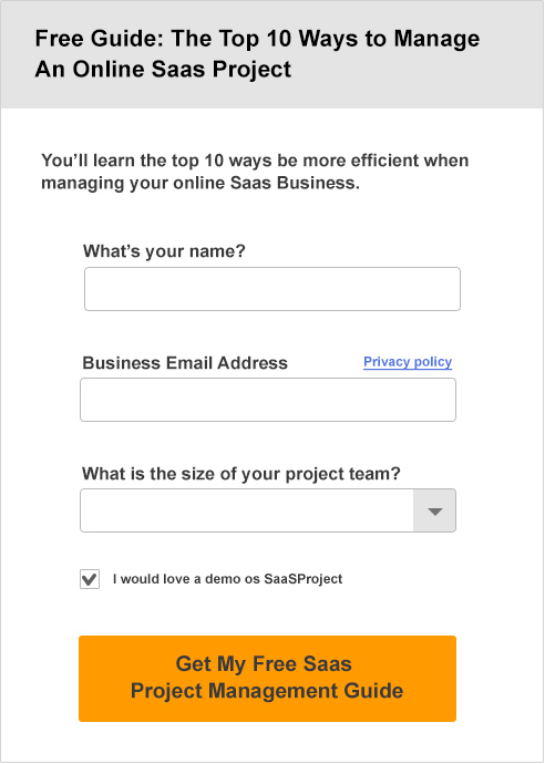
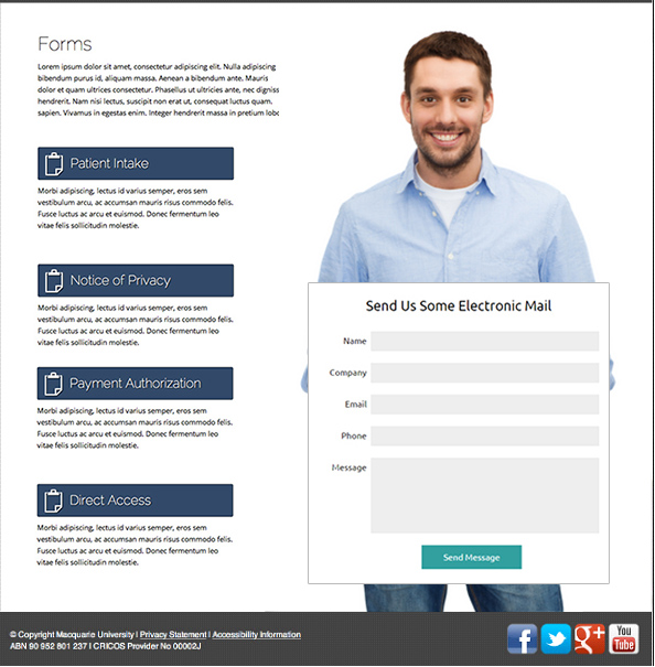
How to design the ultimate lead gen form
With some of the theory regarding forms behind us, you might be wanting to know how to make your form a superstar. Give it center-stage, design your form as if it is the only thing allowed to perform on stage, er, page.
Your form should consist of the following:
- A headline that explains the reason for the form
- A description with points highlighting the benefits completing the form and what the user gets when they complete it
- Descriptive form fields (original questions and label names capture attention)
- A call-to-action
- Links or trust statement
- A closing or context enhancing statement
Here is how a form designed following this method could look:
Have we melted your heart yet? Feeling loved-up on forms? You’ll learn to. Love your form and it will love you back.
Part four: Make like the “Mad Men” and write copy that converts
The words on your page the first things people will pay attention to when it loads, and they are the last thing people will read before making a decision as to whether or not they meet your conversion goal.
You’d be a mad man (or woman) not to follow this advice.
That's exaggerating, of course; you should try to least spend about 5% of your time writing the body of the copy for your landing page, however that statement should give you a sense of the relative importance of the page elements when it comes to rate of conversion optimization. It is for this reason, we are going to explore these two elements (the headline and the CTA) in more depth before trying to get you out of here before the close of business.
Begin with your headline
You've probably been to a job interview at some point, or you are an entrepreneur who wants to be heard by potential customers or investors.
Either way, the most important and the ONLY important thing when starting a conversation with anyone, is getting your foot in the door.
That is the purpose of your headline.
If you write a headline that is useful and interesting enough to hold the attention of someone, you have paved the way to conversion. With that out of the way, you have the opportunity to pitch or communicate your idea.
We are not looking to write award-winning prose – when it comes to creating effective headlines for landing pages, always aim for clarity ahead of clever.
Clever draws attention to itself casting the message in its shadow.
Clarity leads to conversion.
Theirs is an art behind crafting effective headlines, but some techniques and formulas can help you to get started.
Let’s be clear though. These pointers for writing construction, not guaranteed success formulas – because there are never any guarantees.
The point is, you can use these constructs for exactly that – the construction of your headline. The headline’s success depends on the strength of your idea plus your enthusiasm.
Let’s return to the writing:
Joanna Wiebe of Copyhackers suggests these formulas for headline writing:
The Only Way to (Do Something You Want to Do) without (Doing Something You Don’t Want to DO)
The Only Way to Turn Off the Lights without Getting Out of Bed
[Do Something Difficult] in [Length of Time] or [Guarantee]
Tune Your Guitar in 10 Minutes or "Guitar Tuner App" Comes Free
They won’t work for everything, but they are food for thought.
We suggest presenting the landing page value proposition in a sequence of three headlines spread throughout the page, like the classic dramatic works arc of exposition, climax, and dénouement, thus:
- Main headline
- Reinforcement statement
- Closing argument
You may construct your story like this:
Statement of uniqueness
Backed it up with a statement of support to help establish credibility
Expand the experience
And explain how to solve a problem
Close with a sense of urgency to encourage the call-to-action click
For example, if you have launched an advertising campaign for a luxury make of car (Duh, don’t we all do that?), your sequence of three headlines might read a little like this:
- The Only Luxury Car You Want to Drive
- The Epitome of Style and Performance
- The Benchmark of Your Success
What this is doing is providing bold statements that leap out at visitors quickly scanning your landing page.
Now move to your call-to-action (CTA)
As we said earlier, your CTA is of utmost importance because it represents the difference between your campaign’s success or failure.
To click, or not to click. That is the question (facing visitors to your site).
CTA can be broken down into numerous factors, such as:
- Description (being clear about what a user gets)
- Actionable phrases (using active verbs like “get”)
- Possessives (selecting “my” instead of “your”)
- Subtext (information supporting your campaign)
- Urgency (giving visitors a reason to act now)
Expanding on that, we are going to give an explanation you should memorize as a matter of national security:
Every time a button is added to your landing page you need to record exactly what happens when that button is clicked, then write a summary of those words on the button. It needs to be be specific and driven by giving visitors the desire to click it. Include words like “Get” at the beginning to emphasize a visitor gets something by clicking it. Use “my” instead of “your” to make the connection more personal. Encourage people to click the button NOW! Give some extra detail or context in subtext either in the button itself or as an addition beneath it.
Here is an example of call-to-action based on these five key factors:
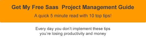
Breaking the button down you can see all components work in harmony.
The description: "Get My Free SaaS Project Management Guide" describes what a user will get by clicking.
Actionable phrases: "Get" tells a user they will receive something.
Possessives: "My" speaks to the user at a personal level.
Subtext: "A quick 5 minute read with 10 top tips!" explains extra benefits of the offer in an easily digestible format.
Urgency: "Every day you don't implement these tips you're losing productivity and money" points to a potential problem for the user explains how the offer can help them.
OK, I understand the basic structure, now how do I write CTA copy?
Ask yourself two questions:
What is the motivation of my prospect for clicking this button?
What will my prospect get, when he or she clicks this button?
In short:
If your call-to-action conveys your offering’s relevance and value to prospective customers it will lead to more conversions.
However there are also some pitfalls when it comes to CTA that can kill conversion and it comes down to negative connotations
We recommend subtext under a button. A little whispering in someone’s ear to encourage them to click, anything from special offer reinforcements to privacy statements, there a few words that are certain to be passion killers and you may not even be aware of them.
Consider this example. You fill in the form and you are just about to click the button, then suddenly, your eye catches the word “spam” contained in the sentence “we will never spam you”.
The sentence may have been written with good-intent but it is the negative connotations associated with the word “spam” that can be cause for hesitation sowing a seed of doubt in the mind of the user at the worst possible time.
A/B tests show the inclusion of “spam” in CTA supplementary phrases causes rates of conversion to crash by 18.7%.
Part five: Design theory in a few minutes
People who think design is just pretty pictures are way off the mark...
As people who have seen more landing pages than most people (hey we design them), we have seen more than our fair share of designs that could best be described as train wrecks. Designs so offensive that out of some schadenfreude, we love them more than the good examples.
The function of design is all getting attention.
Your ad is to capture attention, your headline is to hold that attention, and the design of your page is to focus that attention. This means your design goal is to attract attention to the most important part(s) of the page.
The first principle - directional cues
Here is an example of a landing page.
There is little doubt surrounding what the purpose of this page is.
The secret here is to use design elements in combination so once you have shown people where to go using directional cues, the message is clear when they get there.
The second principle - encapsulation
Here’s an analogy for you, think of encapsulation as installing a window on your landing page to take advantage of the view of your CTA.
Check out the following landing page. What is the stand-out feature? The form. Easy, yes? Well, it seems not when you look at other lead generation pages.
It's easy. Just wrap it up...
The third principle - contrasting colors
Unless you are a complete novice at this (and you probably wouldn’t have read this far if you were) you will have already read about button colour A/B tests. Red is the best, green signals “go”… Disregard it.
It is as simple as this: Look for the predominant color of your page, pick a complementing hue for your CTA. This has been done twice in the last example, where the form’s container contrasts starkly with the page and the button should contrast with that.
The fourth principle - white space
Space things out.
When it comes to white space we like this because it is clear what its purpose is (however the attention ration is seriously off).
Two columns, plenty of white space and a smile that could advertise toothpaste. There is always a need for content, but it can be spaced out effectively.
And now for a train wreck.
A Google image search for “worst landing page” resulted in this:
We repeat. Space things out.
What we mean is when you use these design principles to drive conversion, you focus your attention on your CTA makes it clear how strong or weak your CTA copy is.
Part six: Please, Gods of the internet, grant me more conversions
Why are we looking to deities? What is our point?
We will spell it out for you. You should always ask for more after every conversion takes place.
When you get a lead – meaning when someone completes your form – the results you can get by requesting more can be amazing.
A conversion doesn’t mean the end of your marketing. Where people have shown intent there’s your opportunity.
Post-conversion marketing (PCM)
The act of requesting and, more importantly, getting more from leads, is known as post-conversion marketing. It describes the process of continuing the conversation with a lead on the confirmation page they view after filling out your form.
PCM in action - What you should do
Imagine this.
A woman fills out your form so she can download an eBook about coffee-table designs. You then say, "Thanks lady! If you like that eBook about coffee-table design, you should watch our live demonstration of coffee-table assembly!"
It is a scenario that can be applied to basically any type of online business model. First establish interest, then prompt the lead for a subsequent interaction.
Part seven: We play art critic with honest critiques of landing pages
By now you should be a pro at optimizing landing pages, now we are going to survey the horrors of a few landing pages that are just plain bad to you can see what people are doing wrong and how to fix it.
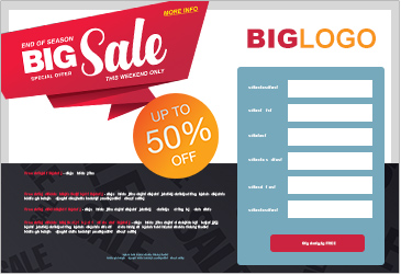
Here is an example of B2C you’re probably familiar with:
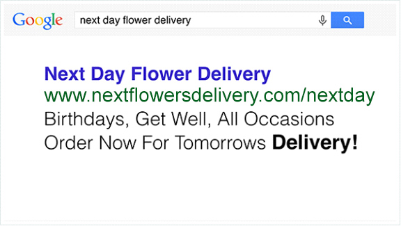
The ad matches the search query perfectly but…brace yourself for the resulting landing page:
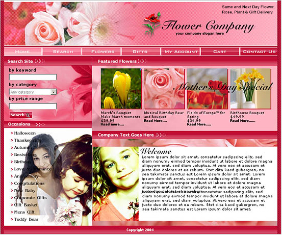
It looks like a Jackson Pollock!
There were three crucial keywords here; next, day and delivery. Now find them. They are squeezed into the right top corner.
The attention ratio of this landing page is more than 120:1
Now let’s take the conversion coupling: The ad text “Next day flower delivery” has no message match with any of the text on the page.
A visitor to this site is going to have a lot of work to do to find what they want.
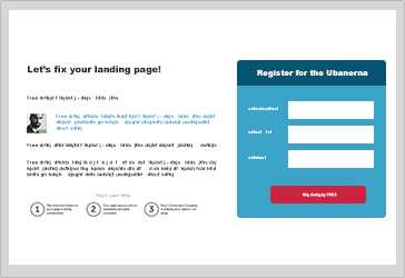
So how would we fix this problem, look at the following mock-up:
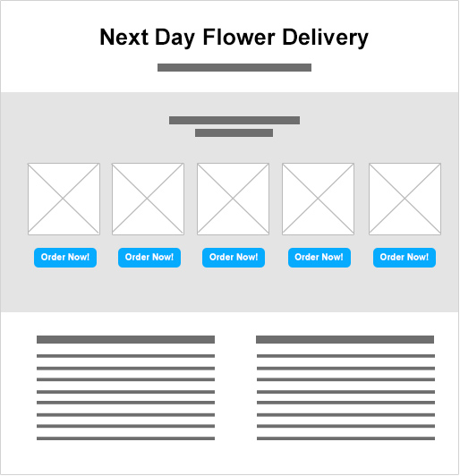
This represents a simple and clean landing experience. However you might be wondering why we have included five CTAs making the attention ratio 5:1. Why break our own rules?
It is because ecommerce represents different types of problems and a solution needs to be adjusted to these circumstances.
The reason this is a good approach to take is because the page still has a single goal – each CTA when clicked performs exactly the same action, it is simply broken down into categories.
In our example, the headline now perfectly matches the search query and the ad copy, making for excellent conversion coupling. A visitor landing on this page will know they have come to the right place.
And, you’ve made it! Let’s look at the conclusions
Here is what you now should know:
- As attention ratio increases, so too does conversion.
- The clearer the coupling is between an ad (or any other link) and a landing page it directs a visitor to, the more likely it is they’ll understand they are on the right page and stay there.
- A powerful way to convert visitors into customers is context. Start the conversation before they make the click and continue it after in a personal way.
- If you show an image or photo of your offering, show it being used in practice to demonstrate context of use.
- For lead generation landing pages, design the form to be standalone ensuring it has six elements that give comprehensive details about your offering.
- Your page’s copy is essential to your campaign success, focus most of your time crafting a headline that is compelling a CTA that inspires a click.
- Remove words with potentially negative connotations from your page. Particularly when they are placed close to your CTA. Words like "spam" or "gimmicks" can negatively impact your conversion rates.
- Design is much more than the aesthetics of your landing page, it is all about creating a user experience that focuses their attention on the ultimate goal of your page.
- Persuasive design will only highlight any failings you have as a copywriter, consider this to be a good thing.
- Always request a second conversion on all your confirmation pages.
- It is OK to have more than one CTA but only when the goal of the page goal is the same for each.
- Examine your own ad to landing page experience and critique yourself honestly.